Friday, 26 October 2012

Fast Shutter Speed (:


(I decided to do action shots with my friends for fast shutter speed, instead of using objects (:..)
This photo was taken out side of our school, at the main entrance. I got my two best friends Meghan and Dustin to throw leaves in the air to it would be a action shot. There was wind that kept blowing the leaves away which made it harder, but that's what fast shutter speed is for :)
 
If you took this shot with slow shutter speed, it would either be blurry or i would be on the ground instead of on the air. That's why fast shutter speed is good to use in action shots
 

 Here is the same picture as above, but it is of Meghan jumping in the air. You can also see her shadow behind her. However, the lighting isn't to great in this photo.
 
This is Meghan shaking her head so her hair is getting whipped back and forth. It is kind of dark, but you can still see the main idea of the photo. (I forgot that you could brighten up the screen on the camera)


This is the time when i remembered that you were able to brighten the screen on the camera! Meghan is on the left, and i am on the right. It might be hard to tell because the pathway kind of blends in with our bodies, but i am jumping in the air, which makes it a action shot.


Thursday, 25 October 2012

Slow Shutter Speed

This was made with a little blue flashlight that I had. It was taken in the gym on the stage where there is no light. It does this because it is on slow shutter speed, which takes a few seconds before taking a picture, which will create something like this. 


 I was the one that made this heart :) I used my little blue flashlight and just kept drawing a heart in the air as if i was drawing it. This is what happened!

We had to go into a change room because people went into the gym, causing light to go up into the stage where we were. We thought it would look neat if we did a reflection in the mirror, it didn't work that well.
 

This photo was taken when the gym lights got turned on, making us visible. Kevin was on the right, randomly moving the flash light, Tabitha was in the middle doing the infinite sign and I am on the right doing a star. :)


This picture was also taken in the gym. I tried spelling my name, didn't work the way i planned. You can some what see the M, the O and the G but that's it. :)

Tuesday, 23 October 2012

Histogram

As you can see on the histogram, this is almost a perfect picture, it is a little bit to bright because on the histogram, it rises quickly at the end.
 
This photo has a lot of brightness in it, on the right hand side where it shows the brightness, it takes a major climb.

I took this photo in the library, and by the looks of the histogram it is almost a perfect picture. The peak of the photo is right in the middle.
 
This photo is fairly dark, the histogram has a big climb on the left side that shows the darkness. It doesn't have much brightness from what the histogram shows.
 
The histogram shows that the photo is to bright, it takes away the point of the photo. In the door way, the light from outside takes over the photo causing to much light.

Shutter Speed, Fast vs Slow


The pear on the left is fast shutter speed, it has no blur and looks like it is sitting still. The one on the left is show shutter speed, it is blurry and you can tell it is dropping.
 
The water fall on the left is a fast shutter speed, showing all the details in the water, instead of in a steady flow. The same photo on the right is taken with a slow shutter speed, making it look soft and flowing together.
 

 (forgot about URL, and couldnt find this photo again)
The drop of water on the left is slow shutter speed, showing just a single drop of water. The one on the right is slow shutter speed, having one single flow instead of one drop


This photo is of the fair ride called the Tornado. The one on the left is fast shutter speed, as if the ride isnt moving, but the one on the right is just a blur, showing how fast it is actually moving.


This photo is like a fountain out of a wall. The one on the left is also a faster shutter speed, showing the drops of water on the botton and the water splashing on the surface. The one on the left look smooth and connected, instead of split up.

http://www.google.ca/imgres?start=339&hl=en&sa=X&biw=1280&bih=929&tbm=isch&prmd=imvns&tbnid=5hvpvirG8MjUqM:&imgrefurl=http://learnphotographywithtomgrill.blogspot.com/2012_07_01_archive.html&docid=C5zMiJn5s_LsHM&imgurl=https://blogger.googleusercontent.com/img/b/R29vZ2xl/AVvXsEgkC13H2ifRlxoIOyuiDOIVpLOreyM_f0ZN1InQ7TZBlot2BmFysutia_vE0f3EDtvLKHRyWU03-clRNPVVJuKCLtq_OvaGcrJ-1TYf_-hZgqIKF3yKQW0aSoLrQdeFuaMFg-pykJfxs3R9/s1600/shutter%252Bspeed%252B1-500%252Band%252B1-30.jpg&w=813&h=308&ei=YQGHUOPEC4iwigK114GQDw&zoom=1&iact=hc&vpx=332&vpy=367&dur=30&hovh=138&hovw=365&tx=165&ty=103&sig=108214024733961383866&page=12&tbnh=116&tbnw=266&ndsp=30&ved=1t:429,r:65,s:300,i:199

This photo is of leaves blowing in the wind. The one on the left was taken with a fast shutter speed, making the photos looking like they havent moved. The one on the right is showing fast shutter speed showing that the leaves are moving, making them blurry.

Tuesday, 16 October 2012

Colour

(I took colour and line photo's separate, rather then together)


This photo doesn't exactly have a main point, if you had to chose it would be the blue paper because it catches your attention the most. It doesn't have a main point though because they all are very colourful, therefore it doesn't fully follow the colour rules. 


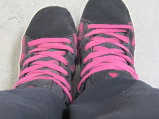
This photo is of my shoes, taken on October 16th. The main focus point is the pink laces because there are no other main colours except the pink. 


The main colour in this photo is the little leaf in the centre shaped as a heart. It is way lighter then the rest of the leafs in the photo. 


This photo is of my teachers car. The main colour of this photo is the red in the back light because it is the brightest part of the photo. 


The main colour and focus of this photo is the sky in the background because it is brighter then the colour of the tree. However, if you really focus on the photo, the texture of the tree catches your attention more.


This photo is of a stool in the hallway, which makes the colour of it the main focus point which is obviously orange. :)


Lines

(I took colour and line photo's separate, rather then together)
 

This photo i took in the library has many different lines, both on the shelf and the books. The white shelf is a line across, and also on the books, the blue line across counts as well. 


This photo is of the fence along out school grounds taken on October 16th around 1:30. The lines that are along the main silver bar in the centre, and the wires that are on top of the bar. If you really look at the photo, the lines that are also in this photo are the sun beams. 


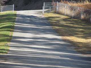
Lines in this photo are the road, the shadows and the fence. The main focus on the photo is the main road down the centre of the photo, also the shadows from the trees on the right hand side that you aren't able to see. The fence at the top and along the side could also count as leading lines, but not as much as the road. 


This photo was taken October 16th at the main entrance of the school. There are so many leading lines but the main focal point is the ramp in the centre. Other leading lines are rails on the side of the ramp, and the shadows on the cement that are from the railings. 


This photo is of a pole in the teachers parking lot, not exactly sure what it is for. But i took it from above aiming it downwards so there could be two leading lines along the side. 


Thursday, 11 October 2012

Colour


The main colour of the photo is the blue behind the circles. When you look at this photo, the blue catches you eye more then the black does. It also has different ideas of leading lines in it, but in circular motion instead of a straight line. 


The main focus on this photo is the red dress, when you look at this photo, the red is more bright, therefore it would be the main colour.


This picture is of a orange, the background is blurred out so you aren't distracted when looking at it. When you look at this photo the first thing you look at is the orange, because it catches you eye before any other part of the photo. They decided to use a more of a natural colour in the background so your eyes go to the brightened orange. 


This photo is yellow and yellow is always known as a happy colour, and it seemed to make me happy. I like how the photo was monochromatic, even though when you really look at the photo the centre of the photo is darker then the rest. Having the middle a darker colour, almost a orange colour makes it become a focal point. 


This photo has a lot of colour in it, but the main focus is the yellow shining down. When you first look at this photo, your eye goes to the centre where it is bright and yellow. The more calm colours, like purple in the background are colours you don't automatically look at. 


Leading Lines


This photo shows leading lines where the image is clear and not blurry. The guitar strings are the main focus, then the shape of the guitar is another. 


The leading lines for this photo is along the shoreline, another line that catches the viewers eyes is the dock in the background. 


This photo really shows leading lines, your attention is caught onto the two white lines in the centre of the photo. There is also a few lines on the edge of the photo. 


The leading lines in this photo is the big whole with the spirals going down it in the middle of this lake. Other focus's in the photo are the shadows from the mountain on the lake. 


This photo has many leading lines in it, the trees and the shadows of the trees. The main focus is the shadow in the middle from the middle tree. 


Tuesday, 9 October 2012

Focal Point


On October 4th i took this photo in our hallway. The focal point of this photo is the green lock, because it stands out from the rest of the photo. The rest is all the same, except for the lock in the centre.


This photo was taken October 4th in the library, i took it against a blank wall so there is no distractions.  The focal point of this photo is the heart on Meghan's beautiful face. Mainly the darkened part on the left side of the heart.
 
 
This photo was also taken on October 4th in our school library. I placed two purple books in between the same orange pictures, the focal point is the purple books. They stand out because they are a different size and colour.


I took this picture in our teachers room on a desk where it is a smooth and flat surface. I took out the pencil shavings out of a sharpener and formed them into a heart, which makes the heart the focal point. It also has texture which makes the photo better.


As you can see, i had fun with the dry erase board and scribbled blue pen all over. Then to add the focal point, i added the red dot on the top right hand side which catches the attention of the photo.This photo was also taken October 4th in Mr Carmichael's room.