Wednesday, 28 November 2012

Edited Portaits

(Tools from tutorial from youtube didn't work, so we just used other effects)


Thursday, 15 November 2012

Photoshopped Photos

You can defiantly tell that this photo was photoshopped, by both the colours of the sand and sky, and the shadows created from the bridge. Shadow can add a lot in a photo by adding emotion, emphasis and many other shapes that don't appear in the original photo. The original photo would not have had such dark and strong looking shadows from the bridge, nor would it have such intense colours. The editing made the photo more calm and non realistic, which adds more effect.
 
This photo has been changed a lot, the waves that are hitting the shore are contrasted, showing all the separate droplets of water. Not only did they use effect on that, they darkened the image making it have a more mysterious look. If it was in colour, it would look more happy and cheerful. Also, they darkened the clouds around the moon, making it more haunted looking. This photo is defiantly a very dark and mysterious looking photo, making it have emotion of more gloomy.
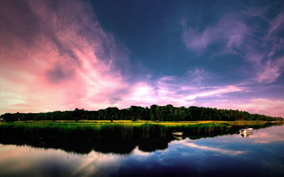
 
This photo has been highlighted in the sky, making it more pink and cheerful looking. They also darkened the trees, making them no longer the focus point. There is a took on photoshop that makes the photo a mirror image in any direction, they defiantly used a horizontal mirror image making it look like two images in one. It happy but also not as cheerful as it would have been in the real image. The made the blue in the sky more darker, and causing the land in the centre more dark makes it not as bright. The emotion would be between happy and depressing.
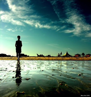
 
I think the emotion in this photo before it got photoshopped would have been more bright and look more like day time. When the person photoshopped it, they shadowed the top right side of the photo, the bottom of the photo, and defiantly the person and their shadow. It makes it have more of a depressing emotion now, giving me a feeling that it is a African boy. In the background, it looks like a very tiny village, but also the water looks very muddy, making it have more feeling and emotion. They contrasted the water, making it look both calm and smooth.
 
Not sure why, but this photo really creeps me out. It looks so happy in the background with the bright blue sky and clouds, but then the shadow of a tree on the cylinder makes it happy a spooky feeling. The original photo would have just been a cylinder with the stair case and the sky in the background. They used the shadow settings, making the shadows appear, making it more interesting and have a different idea than the original. 


Tuesday, 6 November 2012

Edited Photos

Original
Edited
I flipped this photo and edited the photo so it looked more intense, and emotional. It looks not as gloomy but it does look much different then the original
 
 
Original
Edited


As you can tell by the size difference, I cropped this photo so it was just focusing on the centre of the flower, not the entire flower. I also made it green in the colour settings instead of pink like the original
 
Original
Edited
I used the contrast setting on this one, and made the photo very bright making Meghan's face not in focus. I made it all fade away so the only focus points are her eye and the heart on her cheek.
 
Orginal
Edited
This photo is much more brighter and more green, but unfortunately it isn't as clear. I changed the colours making it have a different affect, the centre leaf is no longer the focus point, the focus point would be the leaf to the left of it because it is the most clear part of the photo.
 
Original
Edited
I'm not exactly sure what I did in this photo, I just kept moving the settings in the contrast and colour and this is what happened and I liked it so I kept saved it. It is much different then the original photo, mainly by not having any colour.


Deep Depth of Field


 This photo is clear though out every detail, you are able to see everything and what it all is in this photo, a bowl of ice cream and strawberries!

  This photo shows deep depth of field because there is no blurriness in any part of the photo, you are able to see it all instead of just one single part.

https://www.google.ca/search?q=deep+depth+of+field&hl=en&prmd=imvnsfd&tbm=isch&tbo=u&source=univ&sa=X&ei=CjyUUJToMYnMigKU1oCICA&sqi=2&ved=0CCUQsAQ&biw=1280&bih=929
The focus point of this photo would be the palm tree, but the rest of the photo is also just as clear making it had a deep depth of field.
 
https://www.google.ca/search?q=deep+depth+of+field&hl=en&prmd=imvnsfd&tbm=isch&tbo=u&source=univ&sa=X&ei=CjyUUJToMYnMigKU1oCICA&sqi=2&ved=0CCUQsAQ&biw=1280&bih=929
This is a very neat and detailed photo, showing details of both the mountains and the field. When you really focus on this photo, you are able to see how far this photo is actually showing. There is trees in the distant that are so little, which is showing how far this photo was taken.


https://www.google.ca/search?q=deep+depth+of+field&hl=en&prmd=imvnsfd&tbm=isch&tbo=u&source=univ&sa=X&ei=CjyUUJToMYnMigKU1oCICA&sqi=2&ved=0CCUQsAQ&biw=1280&bih=929
This is my favourite photo to show what deep depth of field is. Not only is it showing deep depth of field, it is also showing leading lines, by having the gravel roads on the left and right and down the middle. It has a lot of detail and it shows a lot of what the area looks like.